Case Stuides
Work
ABOUT
CONTACT
Case Stuides
Work
ABOUT
CONTACT
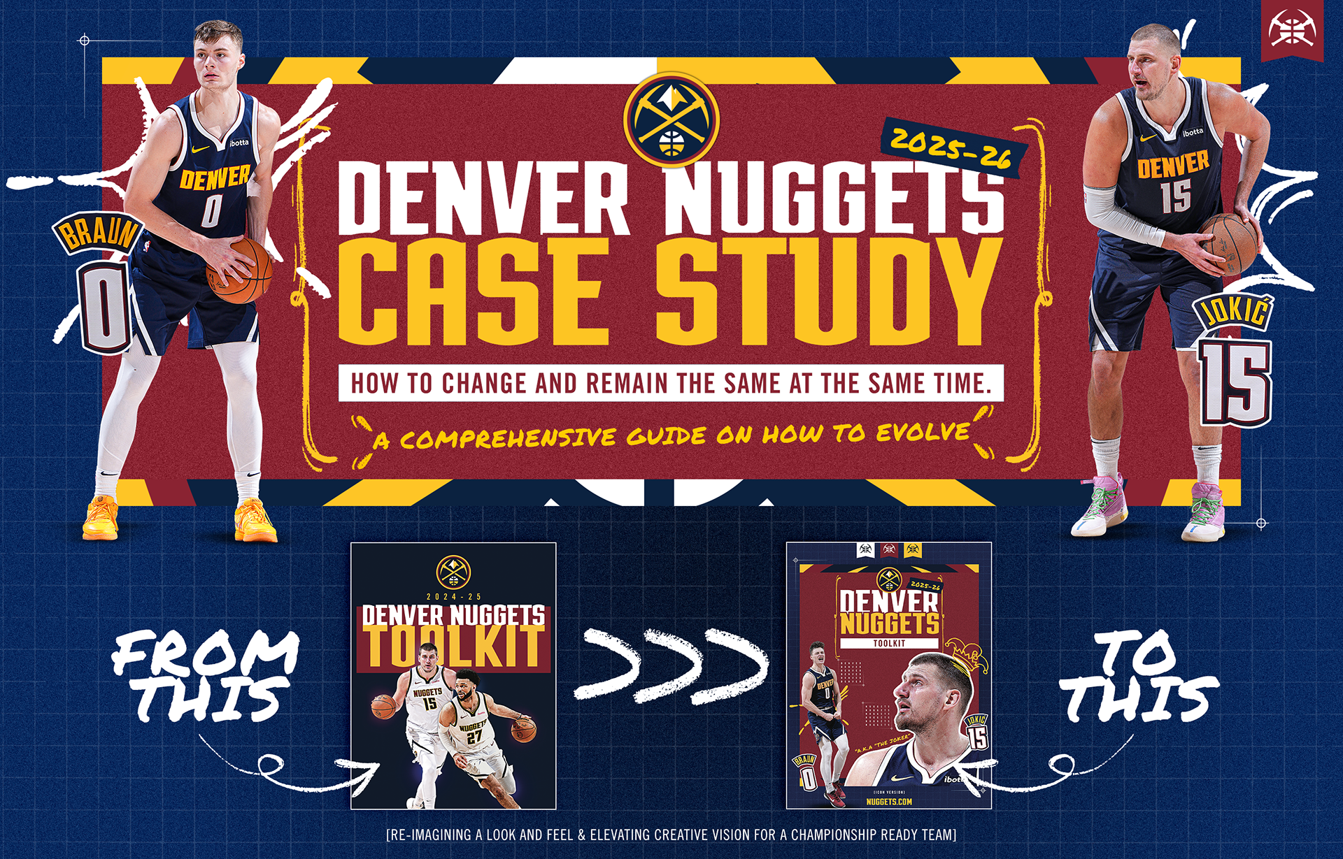
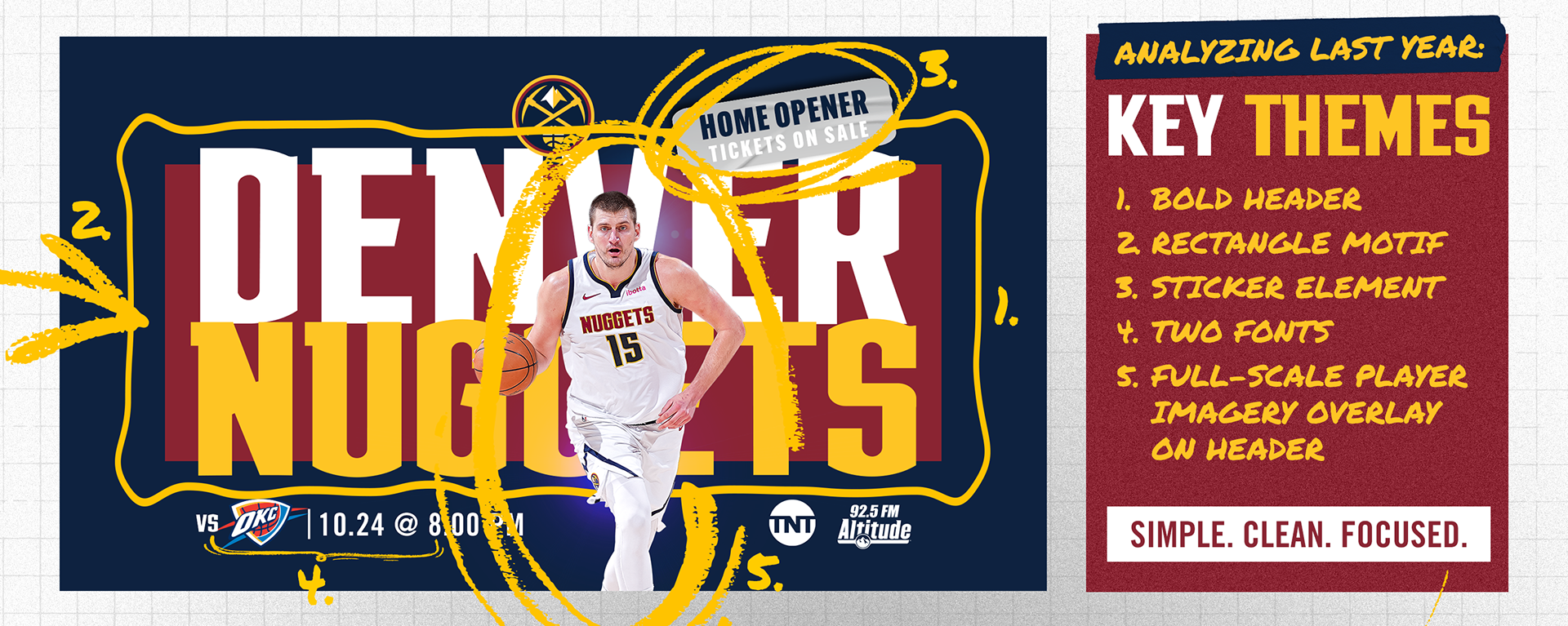
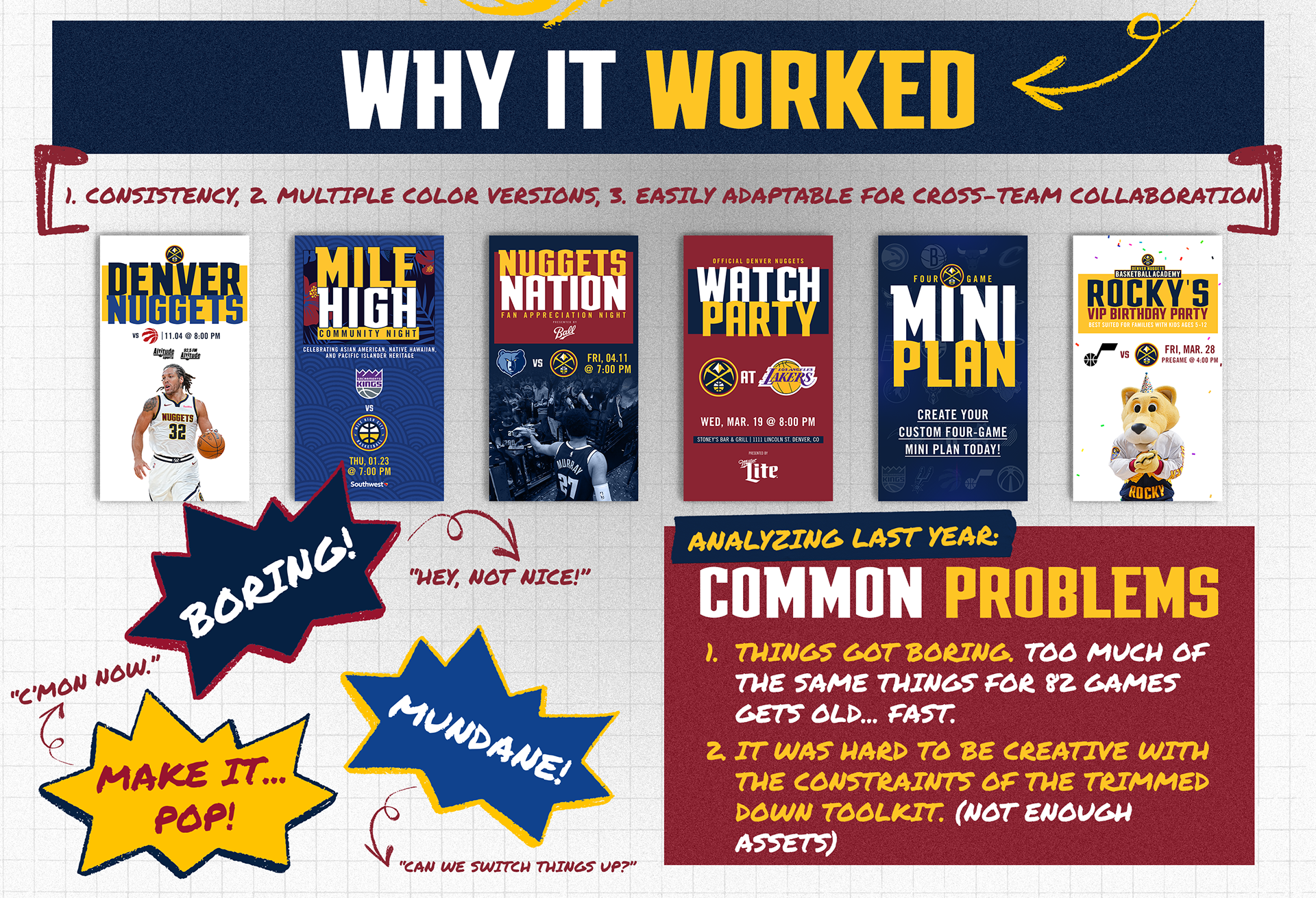
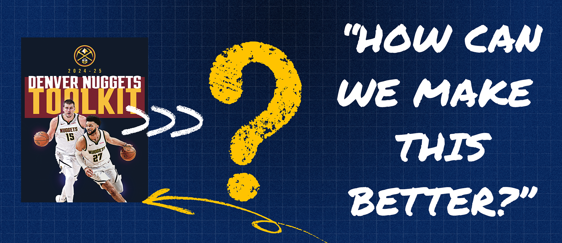
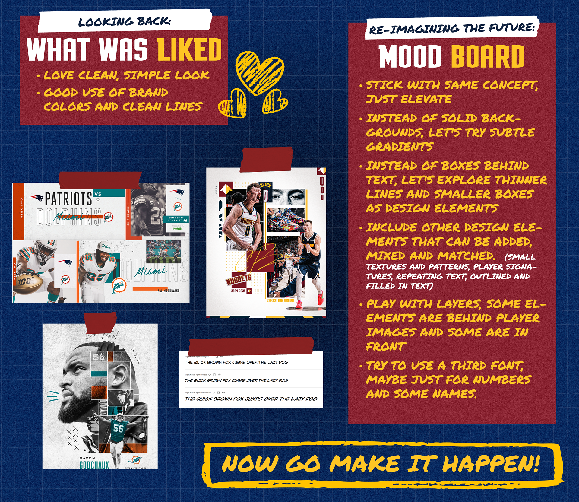
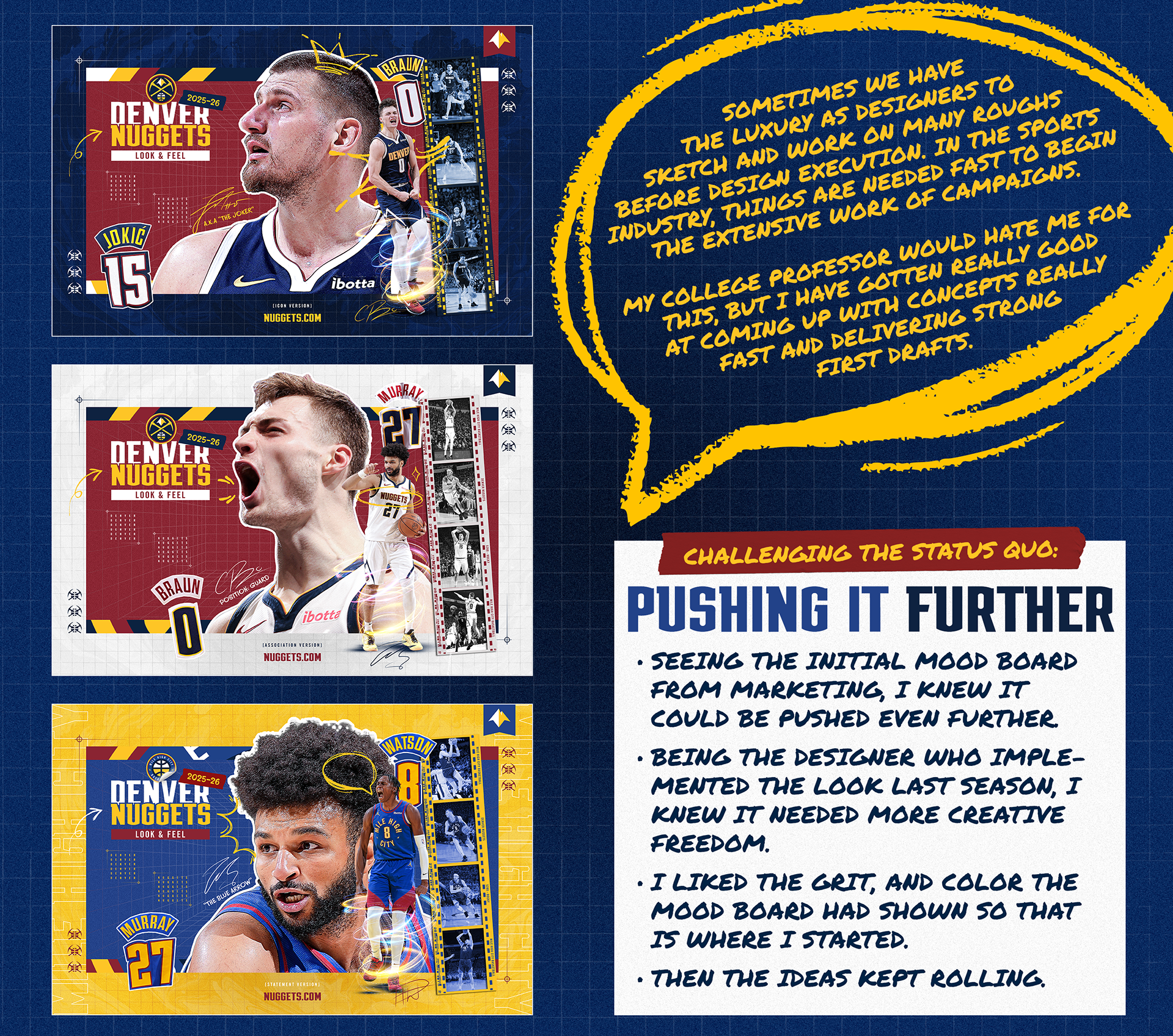
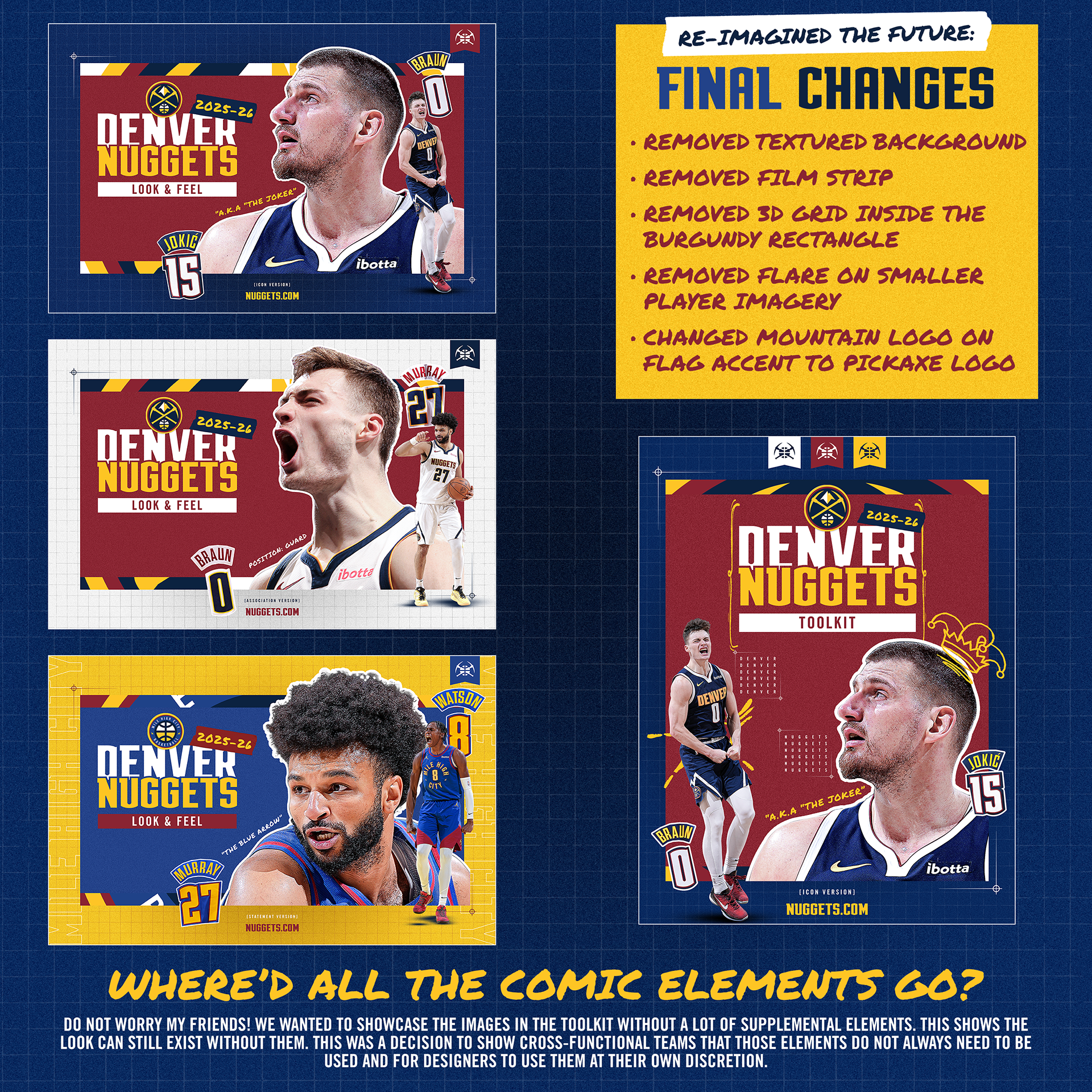
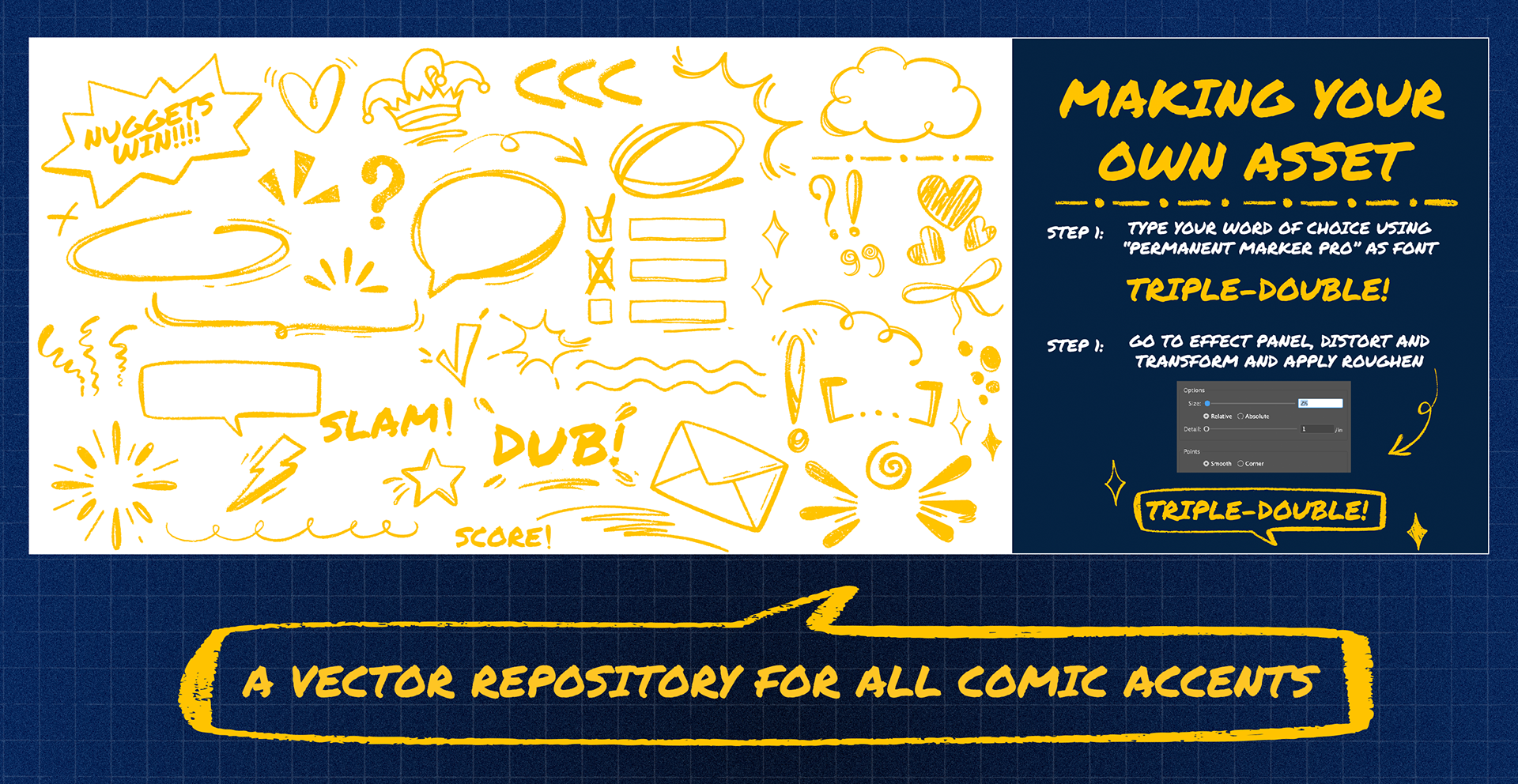
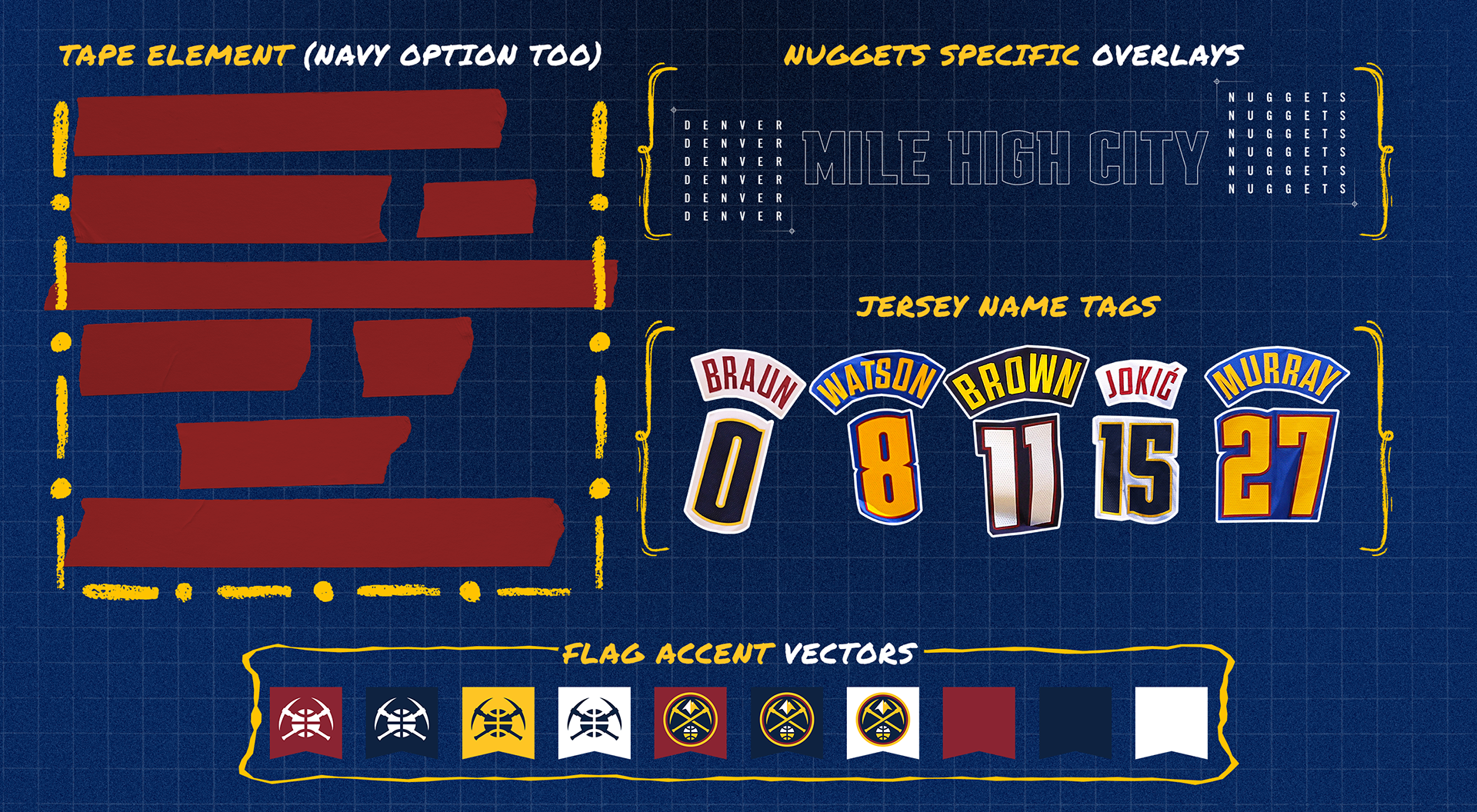
2025-26 Denver Nuggets Case Study
↑
Back to Top